- TOPIC CHANGE -
GRAPHICS OVERLOAD! Muahaha. No, I don't care if you hate it. BUT TAKE A LOOK. OKAY?
So, thanks to the "very inspiring" graphic works in my school magazine, I can't help but think, can we not use basic Photoshop filters without making the graphics look tacky? Filters are basically photo effects you use when you want to make your pictures looks "watercolour"ed, grunge-ified, or whatever. And oh my God, it's been misused so many times over it's getting annoying.
Check out Friendster and Facebook, tons of them here and there. I admit that I've used these techniques to prettify/uglify my pictures before, but now that I know better, time to change! I don't use FS or FB anymore, anyway. So heh.
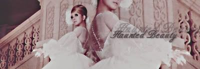
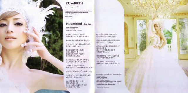
Today, boys and girls, we are going to use these pictures of Ayumi Hamasaki (who else?) for our editing session:
So lets start with Photoshop filters:
Here's the picture with a layer using the filter "Dry Brush" after I adjusted the opacity and layer modes. (And after I did some colorazation and texturing, but that's beside the point.)
I like how it looks like a painting, with a layer of glass on top of it.
Now, let me tell you, we can put two pictures (or even repeating the same picture) together without using the damned Magic Wand tool!
Boys and girls, meet Layer Mask! And for the rest of it, go search for some reliable tutorials yourself. Type "blending tutorial" "photoshop" "layer mask" and whatever other things.
Sorry I'm not so helpful. I just wanted to rant.
*for any of the graphics above, click to full view*
kthxbai.
Now, on to my non-rant graphics part! Showing off for the sake of showing off is the worst. But never mind, I can only do this online anyway.
I personally love this JEWEL set.


They would just normally blend a few screencaps, with the background attached, like this sig I once did:

But thanks to the amount of free time I had to ponder on what to do now that exams are done, I decided to clear the background, to make it stand out among other JEWEL sets. Thank you, brain, for that spur-of-the-moment idea.
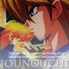



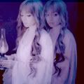

Haha, Ayu looks like a ghost here.
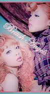

I quite like this TRALALA set. I don't know who the people in it are since I made it as a request, and since the pictures themselves are already stunning, I tried a different style, so this was definitely experimental. I love the outcome, and so did the person who requested it! ^^
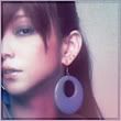

Ayu had a new magazine photoshoot again, ViVi January 2009 issue. And you know what new photoshoots mean to graphic makers with graphic shops?
Mass requests with the same photos of the new photoshoot. *thud* YAY.






I could've said no :P But I guess I wanted to torture myself, how far can I go with the same thing over and over again. Man, I suck.
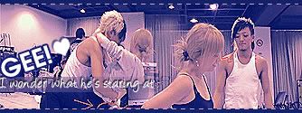
*giggle* Look at that. *giggle*
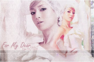
More sets using filters! See, toned down ones don't make it look too annoying.
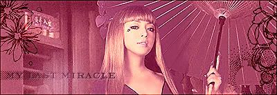
Some wallpapers (2 Ayu, 2 hitomi, 1 Ayumu/Zwei):
Click on the thumbnails, people.
Sometimes, I wonder, why do I even post these here.
Well, if you've actually bothered to read this whole post and reached here, holler at me!



No comments:
Post a Comment